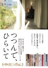
Book-Paper-Scissors (つつんで、ひらいて)
Download English Subtitle
Release info
Tags
English subtitle preview
The first 200 lines.
Seems right.
If I let it sit...
Let's see.
This could be it.
This hiragana "と(to)" is such a nuisance.
How bothersome.
My work may seem strange.
Right now, I must look like a fortune teller on the streets.
Before, I looked like a train conductor.
Now, I'm a fortune teller.
- Tarot cards? - Exactly.
Book Designer, NOBUYOSHI KIKUCHI
"book-paper-scissors"
Part 1: Aligning
Ginza, Tokyo
"Ame No Suso (The skirts of the rain)" written by Yoshikichi Furui
Actually...
it's this book-band.
The material I used is called "tracing paper"
With regard to the haziness no piece of paper is the same.
If 10,000 copies are made, there are 10,000 different looks.
Take off this book-band.
Most people at the bookshop...
they don't bother to take off the jacket to appreciate the inside cover.
But I wanted it to resemble human skin.
At least the feel of it.
The texture of skin was what I had in mind the whole time.
It's my first time using these samples.
This font.
I found this kanji "雨(ame)" which means "rain"
See?
I was thrilled when I found it.
It's never caught my attention before.
When it's raining heavily...
the raindrops splash about and fog up the place.
That's what's happening down here.
Spreads over to this page.
As you turn over the page, an incident occurs.
I've added red over this colored paper.
So it's extremely hard to achieve this color.
Actually, I've added a non-transparent white underneath.
Once I whitened it, I added red over it.
I love this.
Like a strike of lightning.
No matter what kind of genre the story is...
the physical book is the "body" of the novel.
Novels are objects. They live within the paper.
This holly tree here grew with the help of bird droppings.
This nandina shrub, too. They sprouted on their own.
What's more...
as soon as the berries ripen, the birds eat them up overnight.
Then they go drop the seeds somewhere else.
Did you expect your book to come out this way?
Not at all. Totally out of the blue.
Writer, YOSHIKICHI FURUI
I was surprised.
There's something between these two mysterious shadows.
Here's the color of the board, inside is another color.
Then suddenly this.
Anyway, one can see it's been designed thoughtfully.
Mr. Kikuchi has designed so many of my books.
I guess he must suffer as that number increases.
Original work becomes harder.
Being a writer for so long, I find myself imitating my own work.
I always struggle to break the loop.
Mr. Kikuchi and I have a long history together.
He has to come up with new ideas.
So, he must struggle too.
I've never interfered with Mr. Kikuchi's designs or ideas.
I believe in him.
Even with my most recent work.
Published in 1977
Published in 1979
Published in 1983
Published in 1985
Published in 1987
Published in 1989
Published in 1990
Published in 1993
Published in 1998
Published in 1999
Published in 2005
Published in 2006
Published in 2008
Published in 2010
Published in 2014
Published in 2015
Part 2: Measuring
Can we come in?
You often used this café for meetings, according to your essay.
It said in your essay.
You came with your editors?
I've used this café like my own dining room.
Those were the days when my career was at its peak.
Written by Nobuyoshi Kikuchi
I was surrounded by a hoard of editors for two whole years.
Good coffee.
Thank you.
Let me see.
This is the place for you.
Okay.
Stat Camera: a machine that enlarge and reduce images and letters.
I find the most important chapter...
and read it thoroughly.
I also consider the editor's message on the book-band.
That's how...
I get to the core of the design.
Start a new line here.
Could you make that smaller?
- But... - Yes?
This is 197 mm.
Assistant, HIROMI JINBO
- Half is 98.5 - I see.
That'll be odd.
Then let's make it bigger.
99?
Yes, 99.
Jinbo adds the finishing touch.
But there's no space.
- Still 99? - Then 90.
We want to emphasize this katakana "ス (su)"
Right here.
So let's make it bigger.
One notch.
100?
Huh? Right here.
This thick one is 100, you'd be overdoing it.
I don't mind. Let's try that.
- But there's not enough room. - You're right.
Let's go with 99.
99 it is.
"Christology" Written by Eisuke Wakamatsu
It's not a matter of how many books we've made together.
We have our differences and it takes time.
It's 1 mm to the left.
The katakana "エ(e)"?
To the left.
Leave "スsu)" as it is.
- It's okay? - Uh, huh.
How long have you been working with Mr. Kikuchi?
Hm...
30...
36 years?
36 years? That's a long time.
Maybe longer than...
you've been around.
You're right.
36 or maybe more.
As long as 38 years?
Unbelievable.
Jinbo digitalizes Kikuchi's hand-drawn plan.
What does your memo say//about the band?
- Make "の(no)" 1% smaller. - 1%?
About the next one.
You see here, I want the kanji "輔(suke)" to be 0.5 smaller.
It looks crowded.
No matter the size?
That's right.
About the kanji "伝(den)" on the spine.
Could you narrow it by 3%?
Narrowed Fonts: fonts narrowed vertically.
The katakana "エ(e)" too.
Narrow it by 3%.
book-band
jacket
inside cover
bookmark
headband
The usual roman letters for "Eisuke Wakamatsu"
Make 1, 2, 3 as well.
- You've changed "e"? - Yes.
Okay, that's done.
Roman letters should be used on the spine only.
Born 1943 in Kanda and raised in Shonan, Kikuchi was the eldest of 3 brothers.
At the age of 19, he was fascinated by the world of book design.
Designed by TETSURO KOMAI
His encounter with Maurice Blanchot's "The Space of Literature"
Having different views on design, he dropped out of Tama Art University.
After engaging in commercial design for 12 years...
Writer, YOSHIKICHI FURUI
he decided to make a living as a book designer at 31.
Designing books with the Humanities is fundamentally...
about typography and letters.
Typography: the technique of designing the size of the text when printed.
They should be in black and white.
Only black and white.
The white of the paper and black letters should be enough to explain everything.
Otherwise it'll seem weak.
Ideally it should be in black ink.
However...
that's personal opinion, my sense of beauty.
Occasionally the text doesn't allow for that.
Text: the sentences in the book, its contents.
The text itself.
So there's a battle going on.
Yesterday, I finished the part that left me unsatisfied.
And...
Being a perfectionist, it nagged me all the way home.
I woke up at 5 in the morning, just thinking about the colors.
I'm making a prototype.
Book-Paper-Scissors subtitles in other languages
Comments
No comments yet. Be the first to leave one.